PACKAGING_BRAND IDENTITY
New, up-and-coming boutique cosmetic brand Sesta meaning ‘nap’ in Portuguese offers creams and mist sprays that aid a restful night’s sleep.
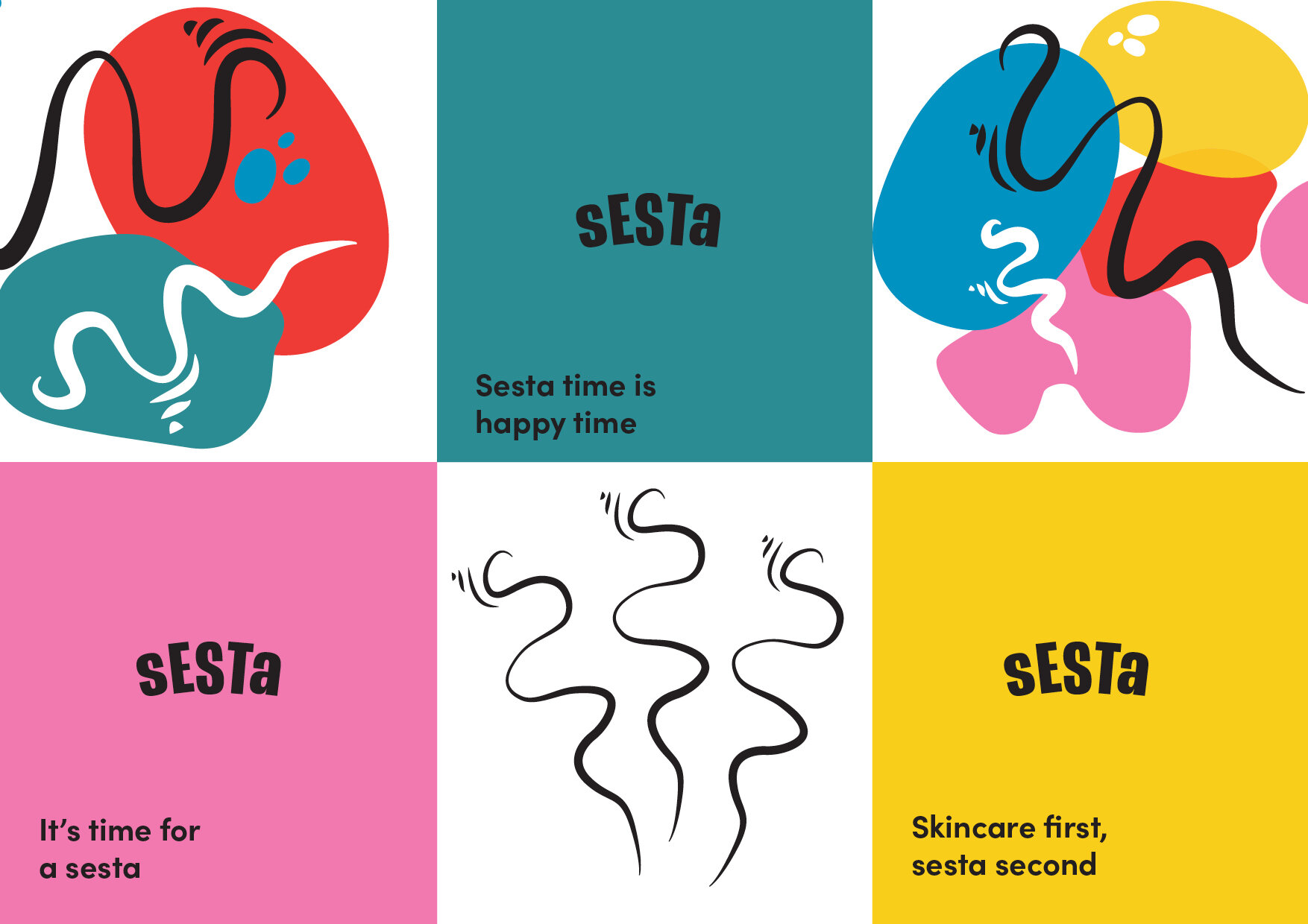
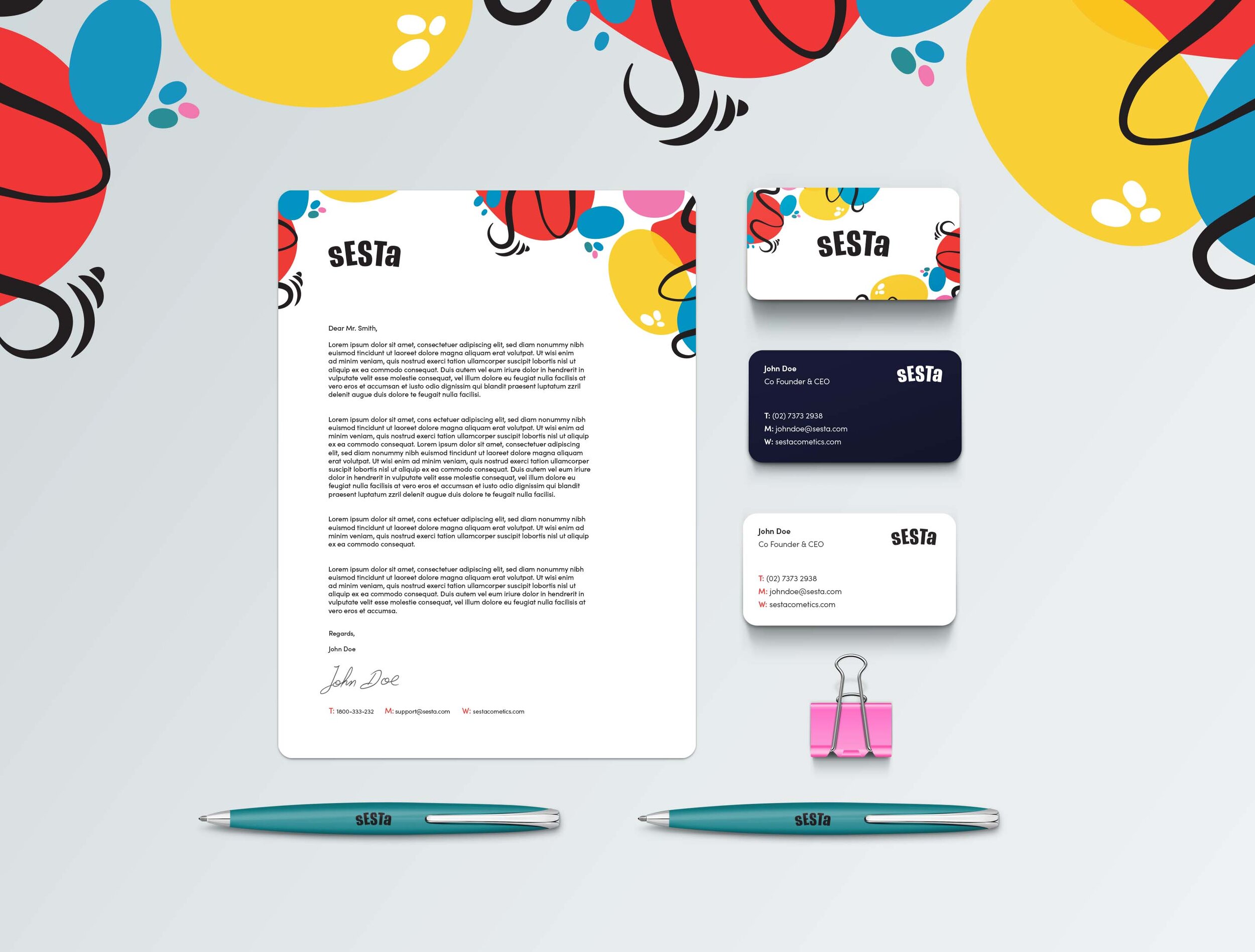
The design objective was to apply pattern work across a range of product packaging, merchandise and set of corporate stationery. The design had to have great shelf appeal, be easily distinguishable and was bold, bright, eye-catching and relatable.


